Symbology Dialog

Setting Up a User Defined Display
In addition to the Default display, you can define up to three unique thematic definition sets by selecting the named entry in the Thematic Definition Set list box.

Setting Up a New Display Scale
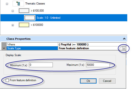
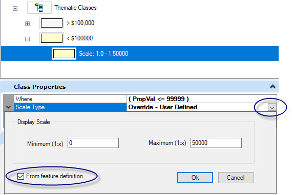
When a thematic class is added, it includes a default display scale which is set to the Zoom Min and Max values found in the feature definition in the project schema. The display scale defines the feature symbology at a specific view scale range.
To edit the default display scale:
To add a new class:
- Choose Add Display Scale from the toolbar, or right click menu of a selected class. The Display Scale Editor will open.
- Enter the minimum and maximum values for the new display range and click OK. To set the maximum to Unlimited, enter 0.
- If an overlap of scale ranges is encountered, an error message will be displayed. A message may be presented indicating that the chosen scale range is overlapping with the existing scale ranges. If you continue, the other ranges will be adjusted so there is no overlap.

Restoring the Feature Definition Scale Range
To restore the display scale to the definition from the project schema, enable From Feature Definition from the Display Scale dialog. If Map was started without a project, restoring from the feature definition expands the range from 0 to unlimited.
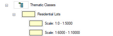
Not Displaying a Feature in a Scale Range
If there are gaps in the display scale ranges, feature instances will not be displayed if the zoom scale falls within the gap. For example, in the image below, Residential Lots will not display if the view scale is between If this happens then the feature instances will not be displayed if the zoom scale is between:5000 and 1:6000.
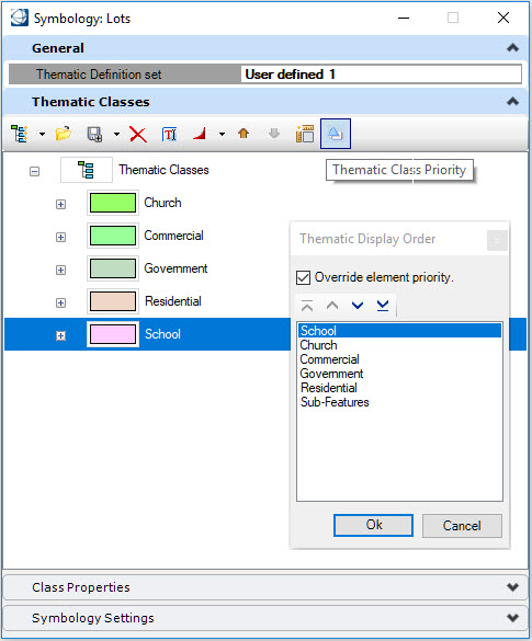
Thematic Classes Display Order
By default, the display order of the features instances that are on the same layers are displayed based on their element display priority. If more than one feature instance has the same priority, the display order is driven by the sequence the instances have been created in the DGN. You can override this behavior and assign a display order per thematic class.
If one or more classes are symbolized using Cartographic Styles, a single entry (named Cartographic Styles) will be added in the Thematic Display Order dialog. The display order of all these classes are moved together. It is also possible to specify if the sub-features of this layer will be displayed on top or at the bottom of all features.
The Thematic Display Order dialog can be opened in two different locations:
- By using the Thematic Class Priority tool in the Thematic Classes panel.
- By using the Thematic Display Order… option in the Map Manager contextual menu .
To override the defaulted display order:
- Turn on the toggle Override Element Priority.
- Move each class up or down to specify its relative display order.
Adjusting Class Symbology
Each class can have its own thematic class or scale range class symbology. Therefore, the same feature instance can display differently depending of the current zoom scale. The sub-features can also have a different symbology definition than their parent feature.
To define class symbology:
- In the Thematic Classes panel, select the class(es).
- In the Symbology panel, expand Display Type and choose of the following:
- From Feature Instance - The feature instances are displayed using the symbology as defined in the DGN element.
- Override - Existing feature instance symbology is ignored and replaced by the specified symbology.
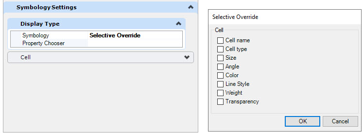
- Selective Override - Provides the option to specify which symbology attributes to override. The options found in the Selective Override dialog is determined by the layer type: Point, Line or Polygon. The dialog is different depending of the type of the layer: Point, Line or Polygon.
- If the Display Type is set to Override or Selective Override, define the symbology attributes by editing the appropriate panels.
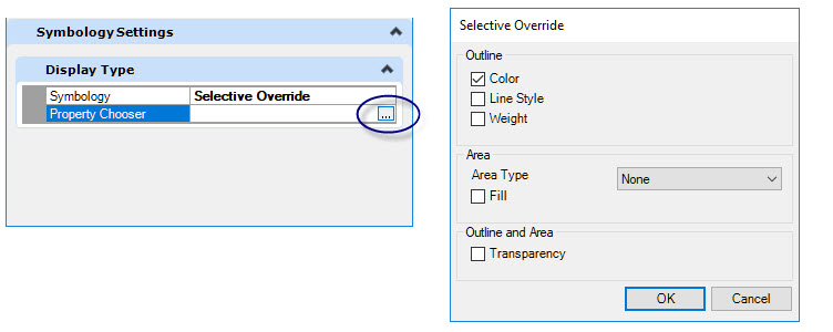
The Symbology attribute panels vary depending upon the layer type: Point, Line or Polygon.

Point-Cells
Differences between a point cell and a graphic cell :
Symbology
- Point: Assumes the current, or active symbology at the time it is placed
- Graphic: Uses the symbology at the time the cell was defined
View Orientation
- Point: Does not follow the view rotation, this is referred to as View Independent
- Graphic: Follows the view rotation, this is referred to as View Dependent
The settings for point-cell features are similar to those found in MicroStation's Place Active Cell tool.
Expected behavior when "Selective Override" is used and only the cell name is changed:
- Point to Point
- The symbology (color, style, weight and transparency) of the orignial cell is used
- The size and angle of the original cell are used
- Point to Graphic
- The symbology of the graphic cell is used, and the symbology of the original cell is ignored
- The size and angle of the original cell are used
- Graphic to Graphic
- The symbology of the graphic cell is used, and the symbology of the original cell is ignored
- The size and the angle of the original cell are used
- Graphic to Point
- The symbology of the first element in the original cell is used
- The size and angle of the original cell are used
If the Display Type is set to Selective Override, the Property Chooser can be used to specify which properties to override.
The Cell pane provides fields to set a number of options.
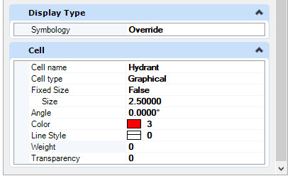
Options include:
- Replace the cell used.
- Define the cell type to Graphical or Point.
- Apply a scale factor to the cell by defining the Size field.
- Set the cell size to be fixed to the same size independent of the view zoom factor. This is accomplished by setting the Fixed Size option to True. When selected, the units for the size can be modified to Inches, screen Points, or Millimeters. The cell will be proportionately scaled so the height is equal to the value of the Size field. This setting is useful when cells need to be a certain size for readability regardless of the view scale. However, it should be constrained to work within a defined view scale range to prevent the cells from covering the display.

Point-Text
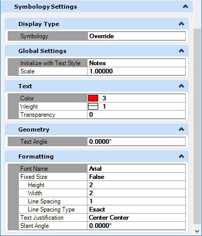
Symbology settings for point-text features are similar to those found in MicroStation's Place Text tool.
Options include:
- Initialize the text parameters by selecting a Text Style. The parameters can be edited afterward.
- Display the text using a different font.
- Apply a scale factor to the text.
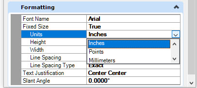
- Set the text size to be fixed to the same size independent of the view zoom factor. This is accomplished by setting the Fixed Size option to True. When selected, the units for the size can be modified to Inches, screen Points, or Millimeters. The text will be proportionately scaled so the height is equal to the value of the Size field. This setting is useful when text need to be a certain size for readability regardless of the view scale. However, it should be constrained to work within a defined view scale range to prevent the text from covering the display.
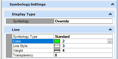
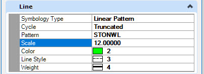
Linear
For linear features, you can select between two types of symbology: Standard and Linear Pattern.
The options for Standard are as follows:
The options for Linear Pattern are similar to those found in MicroStation's Linear Pattern tool. You can change the cell used for the linear patterning.
Polygons
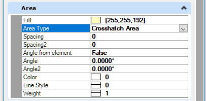
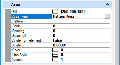
For polygon layers, you can select between four area types: None, Hatch Area, Crosshatch Area and Pattern Area.
The options for None are similar to those applied to a shape in MicroStation. To display the polygon unfilled, select the Color option and navigate to the MicroStation color palette tab. Then turn off the No Fill option.

The options for Hatch Area are similar to those found in MicroStation's Hatch Area tool. Specific options: